- Code: available on github.
- Data: Wikipedia
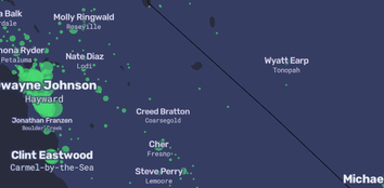
A People Map of the US
"A People Map of the US, where city names are replaced by their most Wikipedia’ed resident: people born in, lived in, or connected to a place."
- By: Matt Daniels and Russell Goldenberg at The Pudding
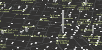
Wiki Atlas
"The tool renders Wikipedia content in a 3-dimensional, web-based cartographic environment. The map acts as a medium that enables the discovery and exploration of articles in a manner that explicitly associates geography and information."
- By: A. Noulas (NYU), D. Saez (WMF)
- Code: none
- Data: Wikipedia
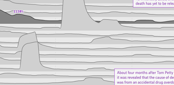
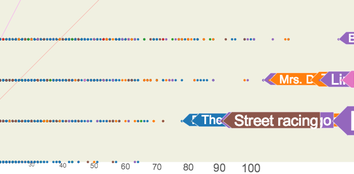
Life After Death on Wikipedia
"While not perfect, Wikipedia traffic serves as a solid proxy for the ebb and flow of a celebrity’s cultural relevance."
- By: Russell Goldenberg at The Pudding
- Code: available on github.
- Data: Wikipedia
- Code: none
- Data: Wikipedia
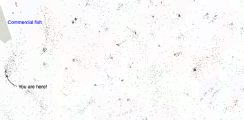
Encartopedia
"Encartopedia helps locate yourself, or to be more precise, locate the subject matter of your curiosity within the universe of Wikipedia articles."
- By: sepans at FastFoard Labs
- Code: background blog post.
- Data: Wikipedia
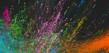
Wikipedia graph mining for collective memories
"Wikipedia can tell us more than is written on its pages. ... In the paper we proposed a new method for patterns detection in large-scale dynamic graphs. We applied the method to the Wikipedia datasets. We have managed to detect dynamical patterns in terms of events and collective memories in Wikipedia using the combination of the hyperlinks graph and the visitor activity on the website."
- Code: WikiBrain on github and pre-processing code on Github (note -- code is pending publication)
- Data: Wikipedia
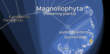
Lifemap
"An exhaustive knowledge of the evolutionary relationships linking all organisms (the whole biodiversity) would produce a tree-like structure, referred to as the Tree of Life (ToL)."
- Code: on github, described in PLoS Biology
- Data: NCBI and OTOL data, and Wikipedia
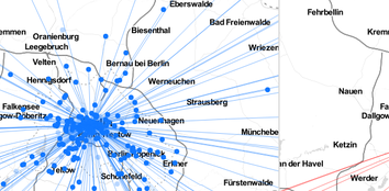
Geolinguistic Contrasts in Wikipedia
"In this project, I intended to explore knowledge diversity across the different language versions of one and the same article on Wikipedia."
- By: Lionel Michel
- Code: concept
- Data: Wikipedia
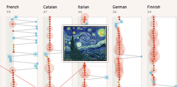
Van Gogh in images on Wikipedia
"The visualization explores how different languages present Van Gogh's work and life by images."
- Code: none
- Data: Wikipedia, Wikimedia Commons
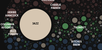
The Universe of Miles Davis
"Miles Davis’ legacy, represented by every Wikipedia page that mentions him."
- By: Matt Daniels
- Code: none
- Data: Wikipedia
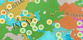
Chronas
"Chronas is a history project linking Wikipedia and Wikidata with a chronological and cartographical view."
- By: Dietmar Aumann
- Code: none
- Data: Wikipedia and Wikidata
- Code: here
- Data: Wikipedia API
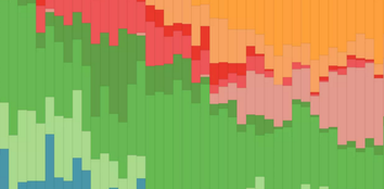
Music Genre Popularity Over the Years
"Wikipedia is a gold mine of lists, lists of lists and even lists of lists of lists. One of these lists of lists happens to be Billboard’s Hot 100 songs which allows us to browse Wikipedia’s data pretty easily."
- By: Brian Brightside
- Code: here
- Data: Web scraping
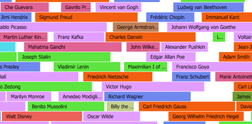
Map of Contemporaries
"The history of the world in famous people’s lifespans."
- By: Yura Bogdanov
- Code: on github.
- Data: Wikipedia dumps
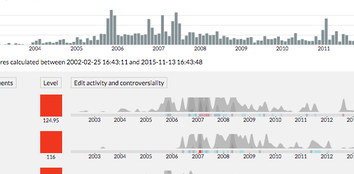
Contropedia
"Enter the titles of Wikipedia articles to view a map of the locations of each edit."
- By: Theo Patt
- Code: available in various packages.
- Data: Wikipedia API
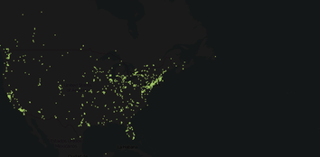
Wikipedia Contributor Locations
"Enter the titles of Wikipedia articles to view a map of the locations of each edit."
- By: Theo Patt
- Code: available on github.
- Data: Wikipedia API
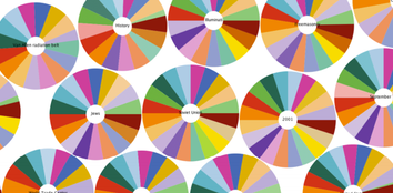
Omnipedia
"Omnipedia highlights the similarities and differences that exist among the language editions, making salient information that is unique to each language as well as that which is shared more widely."
- Code: none
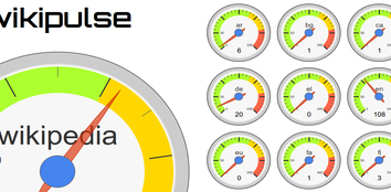
Wikipulse
A simple and familiar dashboard of edit rates to various wikis, including Wikipedia and Wikidata.
- By: Ed Summers
- Code: available on github.
- Data: Wikipedia Recent Changes IRC feed
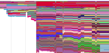
Wikipedia edit history stratigraphy
"Each graphic represents the history of a single article. Time moves from left to right. The varying heights of the coloured section of represent how many lines an article had at each point in time. Articles typically start short and become longer over the years."
- By: Chris McDowall
- Code: none
- Data: Wikipedia XML Export
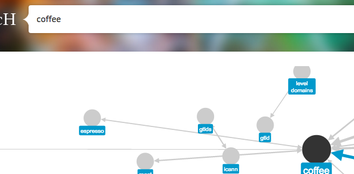
Wikisearch
"Each graphic represents the history of a single article. Time moves from left to right. The varying heights of the coloured section of represent how many lines an article had at each point in time. Articles typically start short and become longer over the years."
- By: Clusterpoint
- Code: none
- Data: Wikipedia Dumps
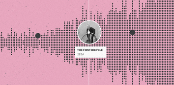
Histography
"Histography is interactive timeline that spans across 14 billion years of history, from the Big Bang to 2015. The site draws historical events from Wikipedia and self-updates daily with new recorded events."
- By: Matan Stauber
- Code: none
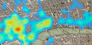
Historic London as Seen from Wikipedia
"While Wikipedia is a most modern creation, its content reflects a historical accumulation of facts and attention. This map of London shows the density of articles in Wikipedia associated with locations in London."
- By: Elijah Meeks
- Code: none
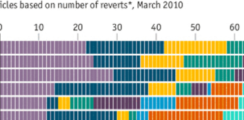
Wikipedia edit wars: The most controversial topics
"Taha Yasseri of the Oxford Internet Institute and colleagues looked at Wikipedia’s different language editions from their inception (January 2001 for English) to March 2010 and ranked the most contested articles, based on the number of reverts and the number of edits the contributors have made (dubbed their “maturity score”)."
- By: Roxana Willis and Lloyd Parker
- Code: none

What is Wikipedia about?
"This visualisation shows the distribution of the 10,568,679 items on Wikipedia, sorted by type."
- By: Paul-Antoine Chevalier, Arnaud Picandet
- Code: none
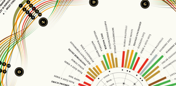
Wikiflows - One Year on Wikipedia
"Which were the most visited pages during 2013? Which were the most edited? What’s the overall picture of one year of history looked through Wikipedia?"
- By: Valerio Pellegrini, Michele Mauri
- Code: none
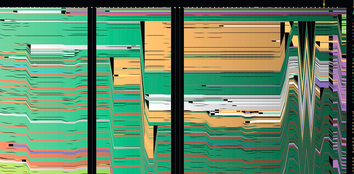
History Flow
"The colorful history flow diagrams take a lengthy edit history and turn it into a picture."
- Code: none
- Data: Wikipedia Dumps

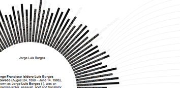
Wikidata Spiral
"Originally created as a means to explore Wikidata's subclass hierarchy, Wikidata Spiral proved to be more useful in visualizing art. "
- By: Drini Cami
- Code: on github
- Data: Wikidata Query API
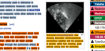
whoCOLOR
"creates an on-demand color-markup of the original authors of the text of any article on the (english) wikipedia."
- By: Felix Stadthaus
- Code: on github
- Data: Wikipedia
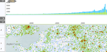
ViziData
"This is a visualization prototype for large datasets of spacio-temporal data from Wikidata. Events for a selected time-interval are shown as aggregate points in a map like fashion."
- By: Georg Wild
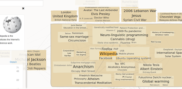
Infobaleen Wikipedia Map
"Each box is a cluster of related Wikipedia pages... like the continent of a world map."
- Code: InfoMap + proprietary
- Data: Raw Wikipedia data
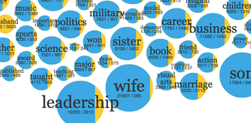
Gender in New York Times Editorial Obituaries 1987 - 2007
"Wikipedia is an influential mirror on society, a means through which we understand our world. Wikipedia also has gaps that we can all work to fill. How are women faring?"
- By: Nathan Matias and Sophie Diehl
- Code: none
- Data: Raw Wikipedia data
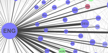
Global Language Network
"Here we use the structure of the networks connecting multilingual speakers and translated texts, as expressed in book translations, multiple language editions of Wikipedia, and Twitter, to provide a concept of language importance that goes beyond simple economic or demographic measures."
- By: MIT Media Lab Macro Connections group + more
- Code: none
- Data: Raw Wikipedia data
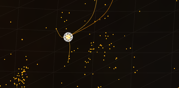
WikiGalaxy
Explore Wikipedia in 3D space by drifting through a galaxy of articles. Each dot is a Wikipedia article, and their connections form constellations.
- By: Owen Cornec
- Code: none
- Data: Wikipedia API
Backstory
"My hope is that Wikipedia stays around for a while so that we can look at 50 years of a topic so can really see from childhood on."
- By: Florian Kräutli
- Code: available on Github
- Data: Wikipedia API
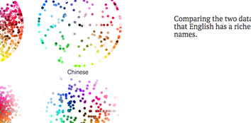
Green Honey
"Language represents our view of the world, and knowing its limits helps us understand how our perception works."
- By: Muyueh Lee
- Code: none
- Data: Raw data
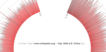
href + U.S. cities
"Is there a correlation between the population of a place and the number of hyperlinks on a Wikipedia page?"
- By: Max Einstein
- Code: none
- Data: Raw pages
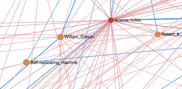
Local Wikipedia Map
"The motivation of this page is to get a little more oversight of the facts and connections which are part of the Wikipedia. To get the birds eye view of Wikipedia we have to focus a part of of the whole we want to focus. This focus should describes a field of articles that interrelate."
- By: Rasmus Krempel
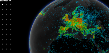
Wikipedia globe
Using geocordinate data from Wikipedia articles, this interactive 3d globe illustrates the concentration of coverage in nine language editions of Wikipedia.
- By: Denny Vrandečić
- Code: available on github
- Data: Wikidata, DBpedia
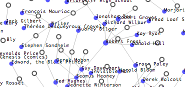
Paris Review Interviews and Wikipedia
"...I wanted to get a picture not only of what Wikipedia articles pointed at the Paris Review, but also Paris Review interviews which were not referenced in Wikipedia. So I wrote a little crawler that collected all the Paris Review interviews, and then figured out which ones were pointed at by English Wikipedia."
- By: Ed Summers
- Code: available on github
- Data: DBpedia - more info
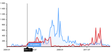
WikiChanges
Using Wikipedia's API, WikiChanges charts and compares revision activity of articles over time, offering insights into the editing patterns of contributors and the attentions of the masses.
- By: Sérgio Nunes
- Code: WikiSym Paper
- Data: Wikipedia API
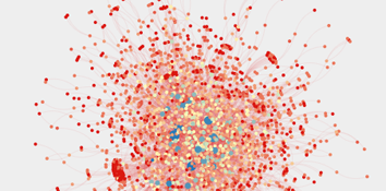
Wikimedia Community Visualization
Community interaction on Wikipedia, based on user communication on on talk pages. The graph is built with Gephi, showing 10,0000 connections between users.
- By: Haitham Shammaa
- Code: available on github
- Data: Wikimedia dumps
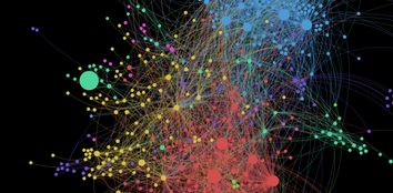
Co-editing patterns on Wikipedia
"These links indicate individuals who have co-edited many pages together on Wikipedia. We use a custom weighting technique, and filter down to the core editors (in every language except Egyptian Arabic and Swahili where we use everyone). The fact that this core is so well connected indicates the coherence of the Wikipedia community."
- By: Mark Graham, Ahmed Medhat Mohammed, Bernie Hogan and Richard Farmbrough, Oxford Internet Institute
- Code: none
- Data: Wikipedia dumps
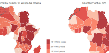
Information Imbalance: Africa on Wikipedia
"At the global scale (in an article that we currently have under review), we found that the number of Wikipedia articles within (or describing) a country can be explained to a large degree by just three factors: (1) the size of its population, (2) the number of its fixed broadband internet connections, and (3) the number of edits committed to Wikipedia by its population."
- Code: none
- Data: Wikipedia dumps, Wikilocation, WikiProjekt Georeferenzierung, Traffic stats
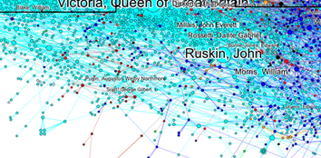
Art History on Wikipedia
"I am a highly visual person. When I have to learn something new, I usually first try to make a sketch of the structure of the knowledge that I want (or have to ;-)) to study. This usually results in diagrams outlining the material, giving it some structured form that makes it easier for me to grasp. "
- By: Doron Goldfarb, Dieter Merk, Max Arends, Josef Froschauer
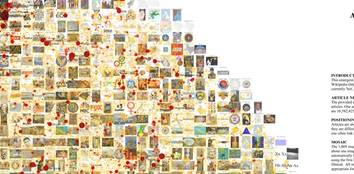
Emergent Mosaic of Wikipedian Activity
"In this case the nodes in the network are wikipedia articles and the edges are the links between articles. We then ... used an algorithm to lay out all 650,000 nodes (wikipedia articles) that had at least one link in such a way that similar articles are near one another. These are the yellow dots, which when viewed at low res give a yellow tint to the whole picture."
- By: Bruce Herr, Todd Holloway, and Katy Börner
- Code: none
- Data: Wikipedia dumps

Flow Circle
"First, this study introduces the Flow Circle, which is a new exploratory data analysis tool devised to solve such problems of History Flow. Second, this tool is used to actually visualize the Wiki revision history regarding gun politics in order to understand and analyze the flow of the revision history and the relationship and conflict structures between the authors based on the results of the MDS analysis."
- By: Jaeho Lee, Dongjin Kim, Jaejune Park, Kyungwon Lee
- Code: none
- Data: Wikipedia dumps
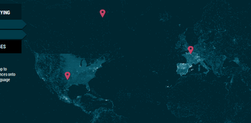
Wikipedia Worldview
"A while ago, Wikipedia introduced georeferences. Georeferences are a way to annotate geographic landmarks, borders, [and] cities within Wikipedia articles ... Wikipedia Worldview is an app to project Wikipedia georeferences onto a 2D plane, intended to analyze the language-based distribution."
- By: Simon Schulz
- Code: none
- Data: WikiLocation
ClusterBall
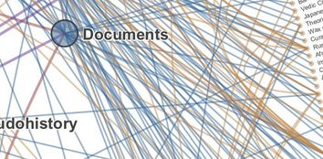
"The clustering component of this visualization is vital. The mere presence of information isn't all that interesting; there is no context or relevance to be gleaned. However, the structure of information is revealing about where fields intersect and diverge, and ultimately about how humans organize information."
- By: Chris Harrison
- Code: none
- Data: Wikipedia dumps

Notabilia
"We analyzed and visualized Article for Deletion (AfD) discussions in the English Wikipedia. The visualization above represents the 100 longest discussions that resulted in the deletion of the respective article. "
- By: Dario Taraborelli, Giovanni Luca Ciampaglia, and Moritz Stefaner
- Code: none
A Map of the Geographic Structure of Wikipedia Topics
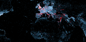
"Since geography is never far from history, a lot of maps show the colonial past of many countries. As ethnic groups don’t always fall inside political borders, several maps reveal the presence of multiple ethnic or cultural groups within a country or of groups stretching across borders."
- By: Olivier H. Beauchesne
- Code: none
- Data: Wikipedia dumps
Map of Wiki Loves Monuments
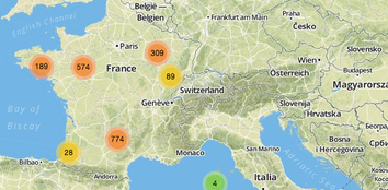
"Elle permet d'explorer les monuments historiques du monde entier."
- By: bzg
- Code: available on github.
- Data: Wikimedia Commons monuments database
wikistream
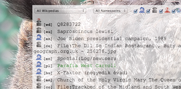
"Wikistream is a Node.js webapp for helping visualize current editing activity in Wikipedia. It uses Node.js, socket.io and Redis to sit in the wikimedia IRC chat rooms (where updates are published), and makes them available on the Web in realtime."
- Code: available on github.
- Data: Wikimedia recent changes feed
Wikipedia Gender
"Using the gender api that I discovered in this project, I wanted to see the relations between the proportion female/male editing and article and its content."
- By: Santiago Ortiz
- Code: none
- Data: Wikipedia API
Wikistalker
"Wikistalker, inspired by ‘Web Stalker‘, is a way of understanding a concept by only seeing the visualization of the meta-structure of its Wikipedia article."
- Code: none
- Data: Wikipedia miner
